By Skylar Ogunshakin and Lizzie Brister, Touchstone Interns
For centuries, people have debated where the line between art and craft should be drawn: Does the material determine whether a piece is art or craft? Is it determined by purpose or intention? Does the line even exist at all? This summer, we set out to learn more about this debate, exploring the differences between art and craft and how modern artists are blurring the boundaries between both. To delve further into this topic, we interviewed several modern artists and viewed their work to see how they incorporate and define art vs. craft.
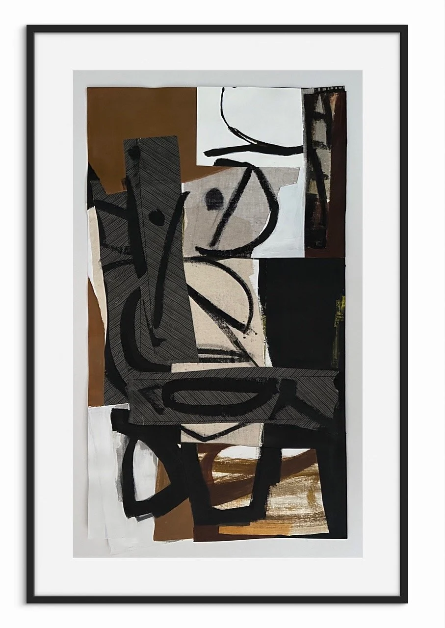
In an interview, Touchstone artist Janathel Shaw shared her perspective on this discussion and the role of her work within it. Shaw is a ceramic sculptor who focuses on social and political issues. Her work explores different aspects and generations of the Black community, addressing racism and social norms in American society. Black American history is not as far removed from the present as it may seem, since many of these issues persist today. From immigration and Jim Crow laws to racial violence and lynching, there is often less difference between the past and present. As a Black mother and educator, Shaw tells the story of children of color and the question of their futures, the absence and struggles of Black men, and Black women having to take on those roles as nurturers and strong providers.

Janathel Shaw, Looking Beyond the Veil, ceramic stoneware with underglaze, overglaze, and mixed media, 19 × 8 × 7 in.
“I don’t consider my work a craft,” Shaw says straightforwardly. She explains that pottery is more commonly viewed as a craft, whereas her own practice in ceramics is positioned within fine art. Because people often don’t associate clay with fine art, when she first began working with it, she had to challenge that perception and prove it could be a higher art form. She also likes the way clay is easy to manipulate: “I get to get messy with it, I get to pull it, I get to abuse it…to get the image I want to see.” Shaw explains that when she thinks of craft, she associates it with traditions that are both community- and family-oriented, such as fiber arts like crochet and knitting, woodclipping, and the overall function of the piece. She reflects on her upbringing in a Black household, recalling everyday handmade objects like quilts on the sofa, dolls dressed in gowns with tissue paper underneath, and statues of Black figures that were not meant to be touched. For her, craft is often less about emotional expression and more about appreciating the time, effort, and technique involved in the making process.
Also, she notes that craft can be defined by recognizing how the work was constructed, and that it often aims to preserve knowledge of these sometimes “lost” practices when makers are no longer present. However, she suggests that when a piece moves beyond function into conceptual meaning and intentional aesthetic design, it begins to shift into the realm of fine art.
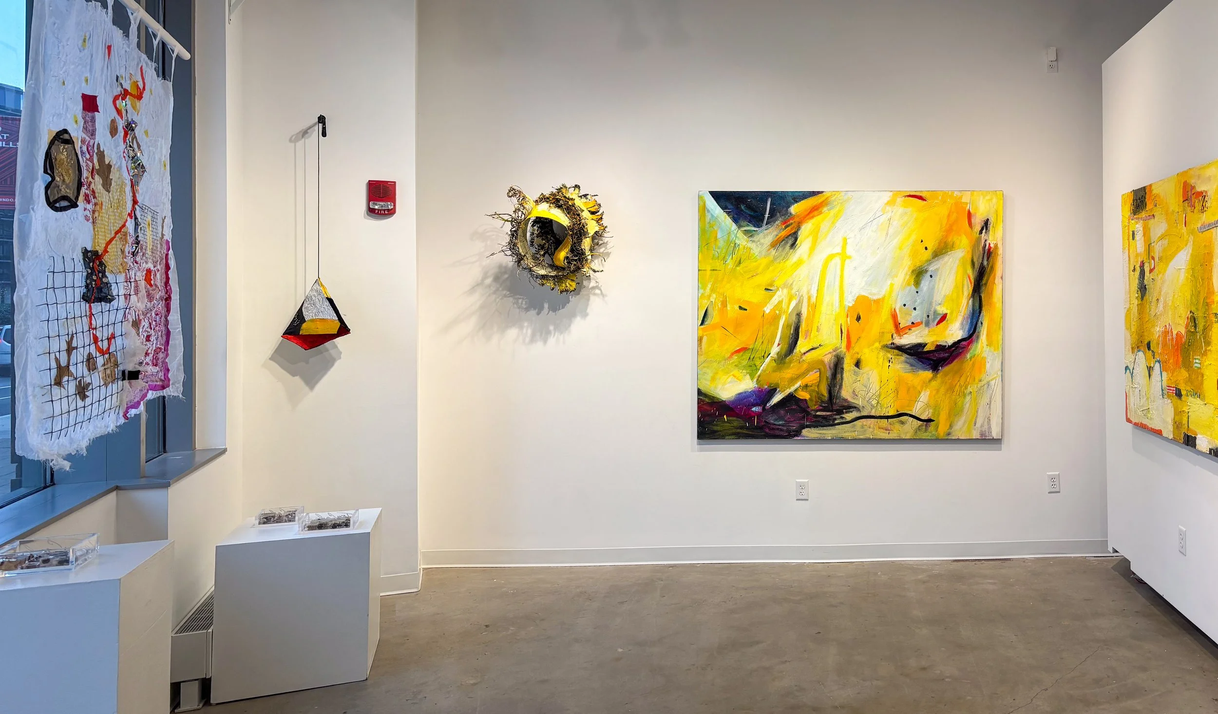
So, if functional vs. aesthetic design is what separates art from craft, what does it mean if a work leans into both? This question can be answered by looking at the work of David Gootnick, one of the 50 local Washington, D.C. artists featured in Touchstone Gallery’s 50 for 50 exhibition. Through intricate geometric shapes and patterns, Gootnick creates designs inspired by the Japanese woodworking tradition of Kumiko.
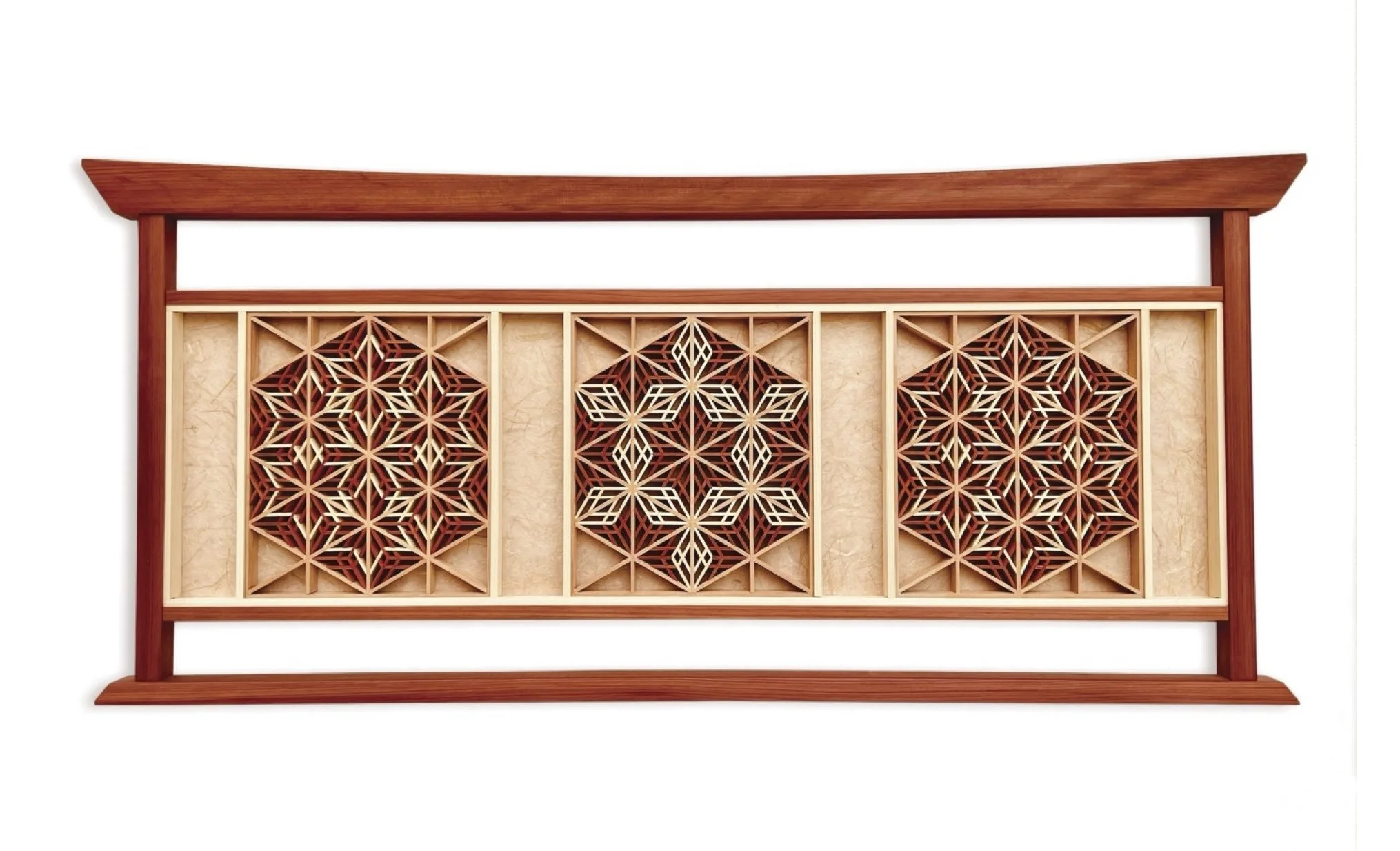
David Gootnick, Triptych #3, 2023, mixed media (wood, washi paper), 14 × 32 in.
Kumiko is a hand-tool technique that involves assembling small wooden pieces without the use of nails or glue. The practice was introduced to Japan from mainland Asia during the Asuka period (538–710 C.E.)
Gootnick originally studied woodworking in high school and later at the College of Art and Design in Rochester, New York. He eventually discovered Kumiko and became deeply fascinated by it. The first pieces he created early in his career were decorative panels for cabinetry. His work blends traditional Japanese practices using geometric patterns such as hexagons and triangles with contemporary design elements. He uses redheart or Osage wood for color contrast and places the design on colored cloth to make his work visually appealing.
His process involves using a long Japanese knife to cut Alaskan Yellow Cedar at an angle, creating interlocking forms. The process requires precision and accuracy as the smallest variation can affect how the entire structure comes together. Throughout his works, he reflects themes of peace, harmony, and symmetry, putting viewers in a contemplative state. Although his work takes on an ancient art form, Gootnick adds his own twist by incorporating rosettes and lanterns. His work leans into both art and craft, as he carefully creates pieces that are both functional and decorative. Gootnick simultaneously creates functional pieces that highlight Japanese architecture and woodworking skills, while also designing pieces meant to play with shape, light, and shadow to create a vivid visual experience.
Lori Katz, Deconstruction, stoneware with slips and black ceramic stains, dimensions variable
Also featured in the 50 for 50 exhibition is mixed media artist Lori Katz, who pushes the boundaries and expectations of clay. She brings meaning to her work through simplicity and strength, using surface, texture, color, and form to create contrast throughout her pieces. Katz developed a fixation with clay at a young age, and the medium later became solidified within her art career. Her work often includes materials such as acrylic paint, oil paint, metal leaf, cold wax, high temperature wire, recycled cin parts, and occasional objects. She develops relationships between rectangles, lines, and circles, establishing a sense of balance and harmony within a space. For Lori, the process of creating art is about the connection and experience people have with her work, whether it offers a sense of calm, becomes part of their homes and lives, or speaks to them on a personal level.
The meaning of art and craft can also be uncovered through artwork at the Renwick Gallery, an instiution focused on craft. In their current exhibition, The State Fairs: Growing American Craft features works from state fairs across the U.S. and explores how craft is used to highlight the traditions, stories, and struggles of the artists.
One piece that stood out was Butter Carton Dress Worn By Princess Kay of the Milky Way. Like most crafts, the dress serves a literal function. Made from 475 square-cornered squares cut from one-pound butter cartons, the dress was created by Wilma Ryan, the mother of Howard T. Ryan, the public relations director for the American Dairy Association of Minnesota. Ryan had the idea to create the dress to promote Minnesota creameries. The dress served both a functional purpose, as it was worn by Mary Ann Titrud, the 1965 Minnesota State Fair dairy princess, but it also serves as a symbol for local culture as it connects back to rural farm life and Minnesota State Fair traditions
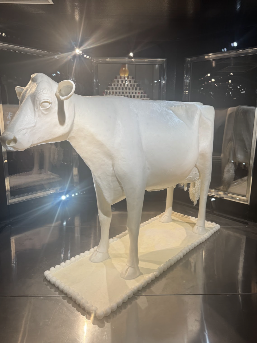
Sarah Pratt, Hannah Pratt, Grace Pratt, Curious Regard, 2025
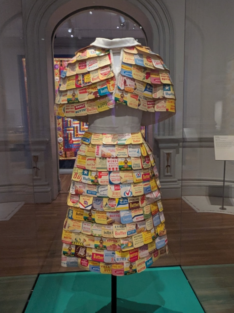
Wilma Ryan and Mary Ann Titrud, Butter carton dress worn by Princess Kay of the Milky Way, Mary Ann Titrud, 1955-1956
Similarly, Curious Regard, a life-size cow made entirely of butter, also captures this essence of tradition. Butter art has been a long-standing fair staple, and the creator of Curious Regard, Sarah Pratt, actually trained under another famous butter sculptor, Norma “Duffy” Lyon, demonstrating how the skill is passed down from generation to generation. Curious Regard reconsiders the boundary between art and craft, since the work is not intended for functional use; rather, it serves as a representative of the history of the practice and fair culture. Pratt, who created this work with her twin daughters Hannah and Grace Pratt, sculpts the butter cows for the Illinois State Fair and Kansas State Fair. Her work proves how much skill goes into craft, and how that skill is backed by long-held rituals and heritage.
With all this in mind, we return to our main focus: what distinguishes art from craft? From what we’ve seen, it seems that art and craft are not merely distinguished by material. It is up to the artist on how they chose the intention and interpretation of their work. While many clay, quilt, or woodworking pieces serve utilitarian purposes, they often also serve conceptual ones. Like Shaw’s work, they can explore social justice issues. Like Gootnick’s work, they can serve aesthetic design purposes. Like Katz’s work, they can demonstrate how material and form can be used to create contrast and meaning, or like the work in Renwick, they can serve symbolic purposes by representing traditions and culture.
The value of work is not determined by whether it fits into one category or another, but by the skill, context, and the idea it communicates. Just because a work isn’t a traditional oil painting doesn’t mean that it lacks all emotional expression, and it’s important to see that labels like “art” and “craft” don't define a work’s beauty, purpose, and intention. Instead, it suggests that artistic work should not be limited by what it could be, and that the creative process often overlaps.
State Fairs: Growing American Craft at the Smithsonian Renwick Gallery, on view through September 7, 2026.
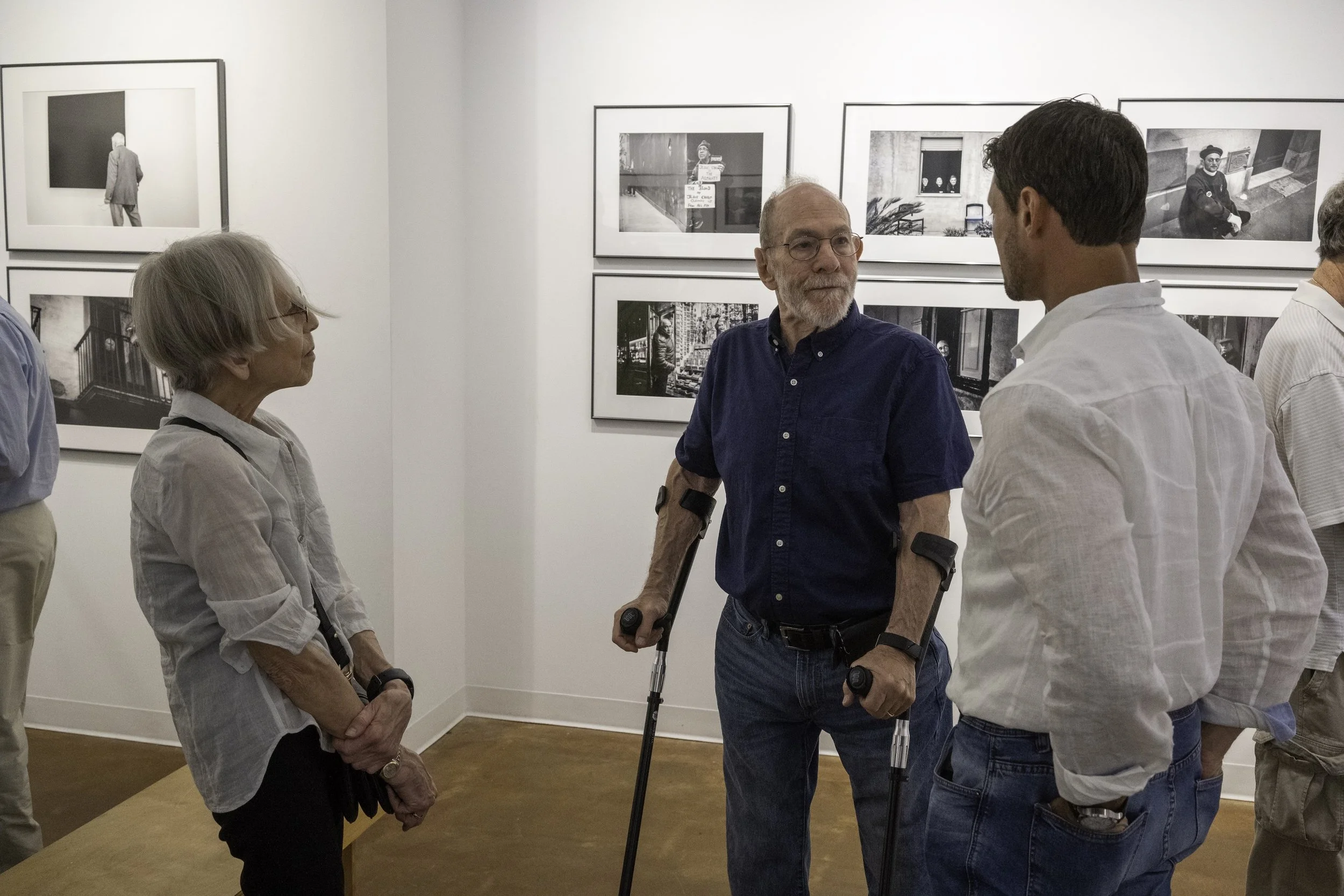
Janathel Shaw’s work, on view regularly at Touchstone Gallery
Lori Katz’s work in the 50 for 50 Visual Artist Spotlight exhibition, on view through June 23 and regularly in her Torpedo Factory Art Center studio.